
Powering the Future: Matelec’s Evolved Identity
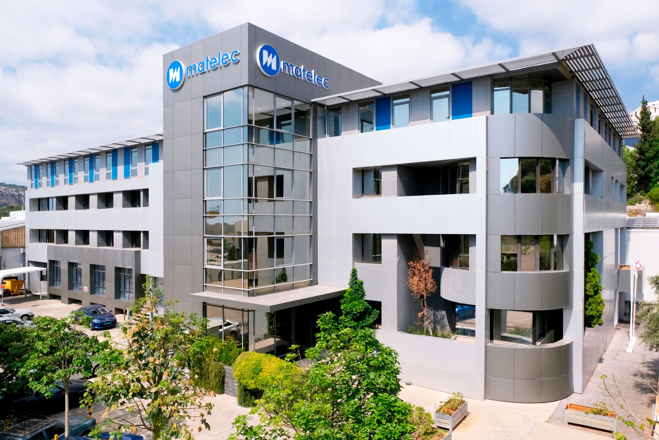
Matelec, a leader in electrical equipment manufacturing and power infrastructure contracting since 1974, has evolved into a multinational presence across Europe, Africa, and the Middle East. As the company expands its reach and diversifies its offerings, a strong and unified brand identity becomes essential to reinforcing trust and recognition in an increasingly competitive market.
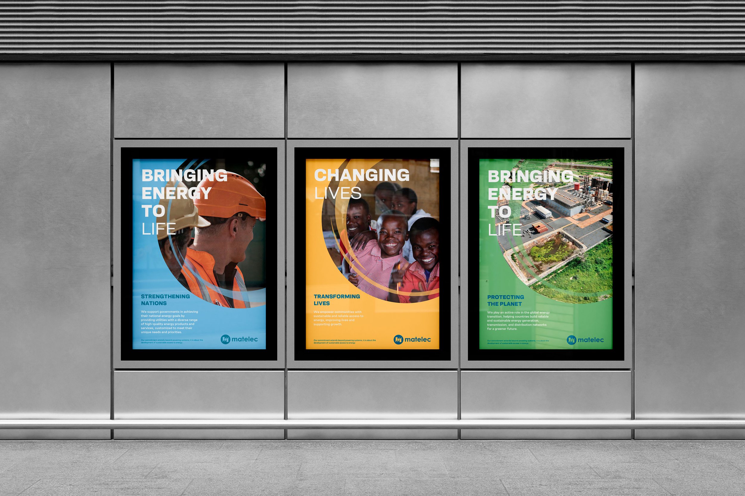
-scope Ateliers led the rebranding by preserving the core equity of Matelec’s identity while introducing a refined and contemporary look. The signature M emblem, inspired by the sharp geometric forms of transformer materials, was reimagined within a circular frame to balance strength with approachability. A new wordmark with rounded type and mixed-case lettering further enhances the brand’s accessibility. Complemented by a dynamic secondary color palette and cohesive design system, the refreshed identity modernizes Matelec’s image while staying true to its industrial roots.
Matelec’s uplifted logo
Matelec’s old logo

Scope of work
